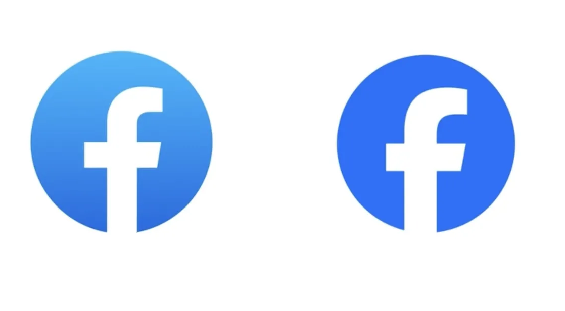
What just happened? Meta imitated X (formerly Twitter) this week by changing Facebook's logo, though you'd be forgiven for not noticing. Rather than introducing an entirely new image that represents the social media platform, Meta's alteration was so subtle that it's hard to spot any differences.
In a 1,600-word post announcing the updated Facebook logo (and other changes), the company boasts about a refreshed design that is "bolder, electric, and everlasting." That might sound like a major piece of rebranding, but in reality, it's pretty much the same lowercase "f" surrounded by a slightly darker and smaller blue circle.
Meta says it redesigned the logo symbol using its custom Facebook Sans typeface. The changes to the letter itself are incredibly subtle, but they can be seen if you look long enough. Well done to those who were likely paid a fortune for this one.
Facebook's logo over the years
In addition to the logo, Meta has developed a new color palette. There's a recurring theme with this one: light blue, sky blue, navy, dark navy, and blue.
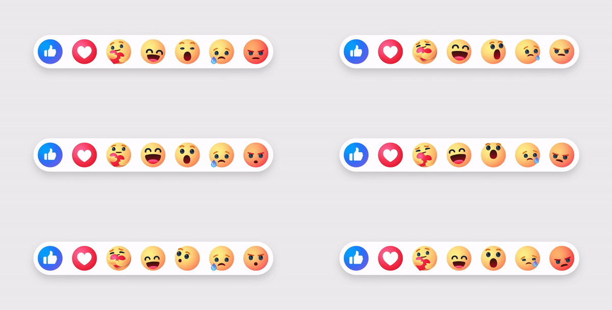
Meta is also updating its Reactions emoji. There's no introduction of the long-requested dislike button, though. Like the logo, the changes are minor enough to be unnoticeable for most people.
The new reactions
"Through our expanded color palette, we were able to evoke more dimensionality and emotion in Reactions," Meta explains. "We adjusted colors to meet color accessibility guidance so that our iconography is legible at any size, flexible enough for different needs and easy for people to interact with."
It shouldn't come as a surprise to learn that Meta's incredibly subtle changes are being thoroughly mocked online.
Meta has updated Facebook's logo for the first time since 2019
– Morning Brew �*ï¸Â (@MorningBrew) September 21, 2023
The differences are striking pic.twitter.com/PKEbTCEcNN
Mark Zuckerberg's tech giant said that it is planning to roll out more visual updates to Facebook in the future, which you may or may not notice.
Facebook's update - of sorts - comes after spending years trying to shake off its image as being the platform for 'old' people as teens move to the likes of TikTok, Instagram, and Snapchat. A survey last year found that Facebook was the least popular site/app among teens, with YouTube on top, followed by TikTok.
Facebook still has over 3 billion monthly active users, around 38% of the world's population, but the rate at which it adds new users has slowed in recent times. Meta will likely hope the privacy concerns surrounding TikTok and a potential US ban for the Chinese company-owned app will boost its own numbers more than a minor logo change.
https://www.techspot.com/news/100245-meta-unveils-subtle-facebook-logo-redesign-you-probably.html


